

A touch of Paris to this DIY budget-friendly Atlanta, GA Kitchen

Finding our House
This was my very first budget-friendly kitchen renovation! This kitchen was the reason my husband and I were able to afford a house in our dream Atlanta neighborhood. We saved over $100k on our home, because the kitchen was in such poor condition. There were pest infestations, plumbing problems, and electrical issues, but we saw an opportunity to live in a beautiful neighborhood at an affordable price, and nothing was going to stop the vision we had for this space.


Almost three years ago, my husband and I purchased our first home. We were driving through the cutest Atlanta neighborhood, and spotted a “for sale by owner” sign.
From the looks of it, we could tell it was a fixer-upper, but that was right up our alley! The house was in a great location, and we were willing to put in the work we needed to get a deal on the house. That “work,” ended up being the kitchen.

The Kitchen Plan
The moment I stepped in to the kitchen, I could see its potential and knew exactly how I wanted to design the space. I’d been to Paris, France a few times that year, and I loved how homely I felt in their establishments. Even though the architecture was modern and luxurious, I still felt comfortable along with a need to lounge. These were some of the same feelings I wanted to bring to our kitchen.

A Galley Style Kitchen
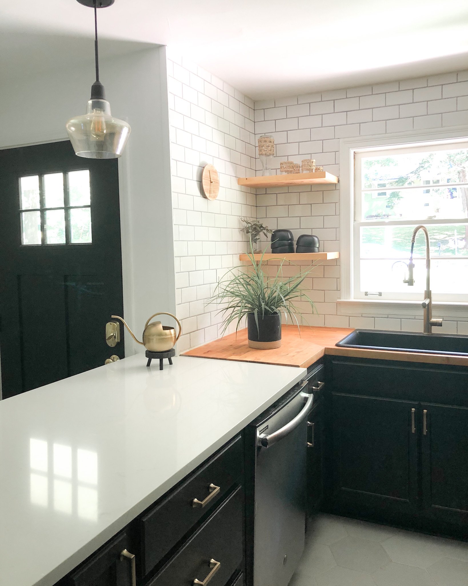
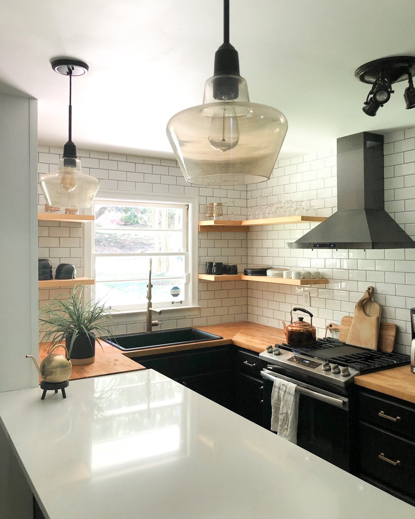
Because the kitchen was galley-style, it immediately reminded me of those smaller cafes I’d visited in Paris during our vacations there. So it was absolutely important for me to incorporate that bistro-European aesthetic while keeping the layout of the kitchen and utilizing the space appropriately.


I started with knocking out the walls, and creating a 14-foot island with a quartz countertop. This makes the kitchen feel like the perfect spot to hangout, drink lattes and eat crepes. I added velvet and brass barstools, and hexagon floor tile to play up this vibe!

The Contrast
If you know me, you know just how much I love contrast! I wanted the kitchen to feel open and airy, but I also wanted it to feel extra moody and sophisticated (like Paris), so I painted our cabinets black, chose a black gas stove and range hood to pop against the subway tile. I decided to go with floating shelves up top, to open up the space. I added counter-to-ceiling subway tile to elongate the walls, and chose butcher-block to contrast the quartz countertop.
Texture, Texture, Texture
I love playing with textures! I decided on wood shelves against the tiled backsplash, and weaved accessories like dish coasters to go along with our bowls and plates. There are textured vintage wine and cocktail glasses incorporated into the design as well, this gives it a boutique and eclectic feel.

Lounging
My ultimate goal was to create a cozy space that would inspire conversation. Having the bar set-up makes it so enticing to lounge and chat with friends over a cup of joe or tea. It was one of our favorite places to sit in the house.

When guests were over, our sink and faucet helped us to rinse cups, bowls, and plates quick and easy; pop them into our dishwasher, and never miss a beat during our fun conversations. I also loved the warm mid-century-style lighting we chose, this style drop pedant sets the Parisian mood just right.

Ajai’s Kitchen AFTER Remodel Began

Ajai’s kitchen BEFORE Remodel
The Journey
We spent $25k to update this kitchen, put in some sweat equity, and budgeted on greenery and foliage. We tiled the backsplash, painted the cabinets, and stained the butcher-block ourselves, and added a faux fiddle leaf fig . It was worth every moment, and we absolutely enjoyed the journey.
I hope you enjoyed this read and I hope it inspires you.
Xo,
Ajai

intentional gifts that inspire gathering with loved ones

Jon my, little one, and I, have been spending a fair amount of time at my in-laws this holiday season, so it was important for me to bring along gifts that would inspire us all to sit around, cozy up, and share stories with one another . Below, are a few gifts that have inspired these moments.


The Perfect Daybed for Better Sleep and Style
I love the minimalist coastal comfort and tranquility that I feel from this daybed. Another aspect I enjoyed was…

A nursery should be the sweetest room in a home. A place filled with calm, smiles, snuggles, laughter, and the sweetest of dreams. Parents spend so much time in this space thus, it should be beautiful, functional, and ultimately a place that is enjoyable. My goal was to design a space that I looked forward to visiting every day. I wanted to feel happy in this space, and I wanted my baby to feel the same. So after having operated in the room for the first few months of my son’s life, I took to my design pad, and began jotting down all of the things that could provide more tranquility for him and I when nursing and relaxing in the nursery.

After jotting everything down, the element that stood out the most was seating. Initially there was a barrel chair in the nursery (I would try to nurse and sleep on this during sleep-training our baby boy) and it was very uncomfortable. I dreaded having to sit there to nurse. Jack (our baby boy) would have to ball up tight, for us to both fit in the chair during feedings. On days when my husband worked east coast hours (we live on the west-coast) Jack and I would have to wake up at 2:30am and relocate to the nursery, while my husband took business calls in our main bedroom. Trying to sleep in that barrel chair was a nightmare.

After spending many early mornings nursing and trying to nap in the barrel chair - I was fortunately able to partner with Sixpenny to give the nursery some much needed comfort and tranquility with the addition of their Neva Daybed. I love the minimalist coastal comfort and tranquility that I feel from this daybed. Another aspect I enjoyed was the customization when making my selection. I opted for the Poly Fill in the Jasmine Rice Medium Weight Linen colorway to suit the needs I had for the piece in this room. Once I made all of my selections I chose white glove service and in the blink of an eye the daybed was delivered and dropped off right in the room.

Since the Neva Daybed has been in the nursery, nursing and relaxing in the room has become a breeze. It has been a pleasure taking frequent naps near the little one as he sleeps in his crib as the daybed offers enough depth and length even for the taller folks (like my husband who is 6’4”) to lay comfortably. I’m at the point now where I almost look forward to some of my husband’s really early mornings just for more time on the daybed.

With all that said, being an interior designer the look and quality matter just as much as functionality for any furniture piece I procure and in this regard the Neva Daybed does not disappoint. Sixpenny purposely designs their furniture with ethically-sourced materials handcrafted to stand the test of time. When the daybed arrived, I immediately noticed the craftsmanship .From the look and feel of the Medium Weight Linen to the sturdiness of the kiln-dried solid hardwood frame and arm. They even went as far as to cleverly conceal the zippers to make it aesthetically appealing, but easy to find in case you need to pull off the slip cover and clean any spills or odors.
To put it simply, the Neva Daybed provided much more than better seating in our nursery, it enriched the space with family bonding, tranquility, and comfort.

The books you need to style a room
These books give designers and anyone looking to style their home, the option to intentionally incorporate books into the design of a space.

Lately, I’ve been feeling a bit guilty about spending long hours binge-watching shows on television. I always leave the sofa wondering where the time went, and with a slight headache. It’s just not the same as cuddling up with a good book and a hot drink. I’ve been missing the simpler days, where I used to read books and get lost in a story, allowing my mind to wonder; creating images for the characters, imagining how their voices sound, and creating the scene where each chapter took place. Reading really allows me to think creatively, and truly frees my mind. Even as an interior designer, I’d been wanting to go on an imaginative journey lately, so when I received the opportunity to work with Booth And Williams, I was over the moon about it, and quick to jump at the movement to replace televisions for books in interior design.

Booth and Williams offers freshly curated book sets and single titles. Their staff draws on its experience in interior design and books to deliver rich palettes of book décor to help you achieve the intended look for your interior space. In addition to the beauty of it all, the books are all readable. So you can imagine how thrilled I was when I received my Modern Beach Book Wall, with over 70 books (yes, you read that right. They sent me 75 stories - to be exact). Seventy-five (75) authentic modern hardback books in crisp shades of off-white. All of my books are published within 1980 through the present, and include a variety of literary works, period novels and topical texts with light overall wear. These offerings are special to say the least, as I’ve officially started a mini library in my home.


Each box sent to me, revealed classics, best sellers, history, and fashion books. My smile grew every time I pulled a book from the box. Not only excited to style these beauties, but at the chance to read titles like “Tuesdays With Morrie” by Mitch Alborn, “How To Know God” by Deepak Chopra, and “Remember Me” by Sophie Kinsella. There were so many stories and authors I recognized, and many I hadn't, which really got me smiling. Books hold a special place in my heart, and I love being able to touch them and breathe life and color into the black and white words written in them (maybe it’s my journalism degree at play here). Nonetheless, I’ll forever be drawn to literature I can physically touch. Books make a home feel lived in, inspire conversation, and imagination.


I love how Booth And Williams gives designers and anyone looking to style their home, the option to intentionally incorporate books into the design of a space. They have the option to order by color, subject, style (vintage or modern), and subject - so many genres! They even have the option to order custom sets. In addition to the book wall, I chose a Tuxedo Arts Assouline Coffee Table Stak, and a Modern Snowfall Color Stak.


The coffee table stak is the perfect complement to my modern bedside tables, and I love the sophistication it adds to my bedroom space. As an interior designer, I must speak to how wonderful it is to have a team of experts curate these book staks. In the past, I’d spend countless hours sourcing the perfect books to complete a space, and being able to shop their website for pre-curated staks makes a world of a difference when working on client projects. It’s also convenient to have a visual of these curated books to add to mood boards. I was able to screenshot my Snowfall Color Stak to add to the moodboard I had set for our small office area, giving me an exact idea of how it would look in the space.


Beyond the fact that Booth And Williams has created a revolutionary way for designers and design lovers to purchase books, what they have managed to provide is a way to share and recycle many of these literary works. The brand is offering access to knowledge, lessons, and art. These books are invaluable and provide so much aesthetically, mentally, and imaginatively. The quality of this product is beyond just the look. Booth And Williams is offering beautifully curated stories.
Speaking of stories, we love a good read, what books would you absolutely have to include in your home when styling a room?

Design Dilemma Apartment Friendly Remedies
I do my best to promote making a space “truly yours. “Have something in your apartment you want to camoflauge?” An eyesore that is bothering you, but may seem difficult to address because you’re renting and living with certain restrictions… I’m so happy to be able to help out and hope these suggestions help to do the trick! So let’s get to it!

We’ve all been there a time or two - moving into an apartment and having some things we absolutely can’t stand about it. I remember when Jonathan (my husband) and I moved into our first apartment together. It was in Long Beach, CA (back in 2013). We called it “The Tree House,” because it was the corner apartment, on the second floor, and basically wrapped with trees. The location was amazing - right around the corner from the iconic Ferris Bueller house and just five minutes walking distance from a Jamba Juice, Coffee Bean, and Whole Foods! It couldn't get any better than that… well actually, it could.
Did I mention the rent was less than $950? We are talking about living in Los Angeles County for less than $1000. Unheard of right? So many wonderful things about that apartment, BUT it definitely came with a con or two (ugly-colored cabinets, wonky hardware, no AC). Nonetheless, I was not about to let those minor setbacks keep us from living our best life in the LBC, so I set out to make our little life in the Tree House beautiful. I painted those cabinets a pretty taupe color, closed the original holes in the kitchen cabinetry, and drilled new holes for brass hardware, leaving the space feeling like an entirely different kitchen. I even took the liberty of installing an AC unit in the window, and let me tell you, it changed our lives.
This is why I do my best to promote making a space “truly yours.” It can make a world of difference for our mental health. This leads me to the question I asked two weeks ago during a “Design Dilemma” series via my instagram stories, and then again via my blog last week: “Have something in your apartment you want to camoflauge?” An eyesore that is bothering you, but may seem difficult to address because you’re renting and living with certain restrictions (per a rental agreement). I received a few dilemmas and will do my best to address them (without an actual visual or dimensions of these spaces). I’m so happy to be able to help out and hope these suggestions help to do the trick! I’ll be listing each dilemma and my solution along with it. So let’s get to it!

Design Dilemma #1
“I have a massive a/c unit jutting out of the wall and I want to disguise it as a cabinet or something but still be able to use it.”
My Answer: About twenty friends asked this question! I really wish I had photos of the first apartment my husband and I lived in, because I ended up disguising our AC wall unit with a wooden box. You have so many choices as to what sort of wood to choose from and what size. I’ve placed an image above for you to get a good idea - I love this sort of architectural piece. You could DIY a box like this or purchase one here. You could also go the less expensive route and purchase a cloth cover here. Once you add the box cover, place plants on top of it to further camouflage this eye sore just make sure the plants can take in the cold air).

Design Dilemma #2
“The mirror closets!”
My Answer: I’ve actually done this one in a previous apartment. Hanging drapes/ curtains over the closet mirrors would offer really nice texture to the space. There’s also an option for a floating look by adding curtain wire with clips. Because you’re renting, I wouldn't advise any sort of adhesive... only because it could be tough to remove, and when dealing with glass (especially in a rental unit - we DO NOT want to break it).

Photo via pinterest / photographer unknown
Design Dilemma #3
“Wonky kitchen cupboards and drab floor tiles!”
My Answer: I’ve been here too friend, at the time, I asked our management company if I could paint the cabinets (got a color approval) and paint the tile white. Here is one of my favorite cabinet paint colors. You just want to make sure your pitch is perfect. If you pitch it good enough, you could even get them to subtract the cost from your monthly rent. This is what they did in our case. I’ve also seen a few people remove the front of cabinets (the cabinet doors) to expose the shelving. Then purchase nice cups and dishes to style the shelves. If you decide on the exposed look, you could even add some plants to doll up the shelves!

Photo via pinterest / photography by Dorothee Dubois
Design Dilemma #4
“My rental is so dark!”
My Answer: With permission, paint it white! Also add a light-colored rug to brighten the space. You can even opt for white curtains like the ones featured above.

Design Dilemma #5
“Ugly light fixtures and the world’s most hideous electric fireplace.”
My Answer: Swap out those ugly fixtures! It's very easy to do, but if you aren't up for the task, you could always get a handyman for the job! Plugin sconces also help to change the vibe of a space. Here’s one of my favorite chandeliers to use in rental spaces (it’s easy to swap out and costeffecitve). As for that electric fireplace, give it a makeover! I’d want to see what this one looks like, but in the meantime, I would say to add or swap out the border on it and/or paint it.
Design Dilemma #6
“The terrible light fixtures and old blinds”
My Answer: Check out my response for the light fixtures in DD#5 but as for the old blinds, you can remove these and add curtains/ drapes. Save the blinds so that when you move you can add them back. Removing them is easy (just may be a bit dusty). If you bring it to the property owner’s attention, they may even send someone in to replace them. I’ve had all of the windows replaced in my rental unit before (it’s all about the pitch).
Design Dilemma #7
“Beige walls.”
My Answer: Paint them! :)
Design Dilemma #8
“Non-functional stairs.”
My Answer: This one seems quite unique. It sounds like these stairs lead to nothing… if that is the case, I would totally use them as shelves. I’d style them and add all sorts of plants, books, etc… Just would need to be strategic as far as placement goes (so you can get to each stair in the future).
Design Dilemma #9
“Cream aluminium window frames that I can't stand! Walls are a grey-white colour and trimmings can be painted closer to true white but other than that I have no idea how to soften the contrast & ugliness.”
My Answer: Let’s camouflage these window frames! Opt for drapes/curtains friend. Be sure to extend the rod at least 4” on each side of the window frame (at most 10” on each side, if you’re looking to make the window look wider).

Design Dilemma #10
“I have one of the really old thermostats right in the middle of my living room wall that I would love to camouflage!”
My Answer: Hang a shelf like this below it (like the one pictured above) and style photos etc on top of it. This would be a great way to hide it or just have it blend in.
Design Dilemma #11
“My rental house used to be a nursing home so there’s a neon EXIT sign in the living room. Right when you walk into the house, because it’s by the exit of the house obviously lol. There are a lot of pretty details about my house that I love but I don’t know how to cover this exit sign up. Not sure if there is any hope for this dilemma.”
My Answer: Hi friend, this is definitely a unique dilemma. Not sure if you’re allowed to take it down during your time living there? Check with your property manager about taking it down first. If not, try using a packing tape and neatly place it over the sign. Color-match the paint from existing walls, and then paint the tape over the sign. Should help to blend in after this.
Design Dilemma #12
“our electricity meter and box is really chunky and placed on the right opposite the guest bathroom... how do we cover it up?”
My Answer: Chances are there are permitting and/or code regulations involved in making alterations to this. I would absolutely check with your property management company or landlord to discuss what changes can be made here.
Design Dilemma #13
“Popcorn ceiling”
My Answer: If this is a rental space, you might have to roll with the punches on this one friend. But, if you want to play into this architectural feature (yes, I’m calling it that) you could incorporate more mid-century pieces. When I think of popcorn ceilings, I think Mad Men. It may be worth bringing to your property management company’s attention, because if there is any sign of asbestos, they could remove it at cost to them. Also, if it makes you feel any better, just know it’s there to help quiet the space. So if you are getting a peaceful and quiet night’s sleep, thank your popcorn-ceilings. :)
Design Dilemma #14
“Basement Apartment. Minimal with Boho/Mid Century Modern vibes. The living room has one window and it’s VERY dark. The walls are already painted a warm white (Greek Villa by Valspar). There are 6 pot lights but maybe I should change the lighting? Or maybe get a full length mirror? I’m unsure. Helppp! 😩🤞🏾”
My Answer: A lot going on here friend. I would have to see this! DM me on Instagram and show me a picture of it. I’ll be able to help you out a bit better with a better visual.
Design Dilemma #15
“No entryway! The main door directly opens to the living with an awkward space. Picture this; when you open the main door, to the left is the convertible sofa bed while to the right is the shoe tray and fronting is an awkward wall.😖😓”
My Answer: This one is very specific to your space, send me a picture! :)

Design Dilemma #16
“Apartment paint that you can’t paint over 🤢”
My Answer: Go with a wallpaper here, friend. I’ve been loving some of the designs out there lately. I advise going with a good peel and stick. This way you can easily remove it when it’s time to move out of the apartment. They have so many good options! I’ve been eyeing a feather design, herringbone pattern, water color floral pattern, and a dandelion floral pattern!
Design Dilemma #17
“Sockets/plug points. How to safely disguise them?”
My Answer: I’ve actually been looking at these, as my little guy will be mobile before I know it! I’ve also been eyeing these for a while, but you can go the traditional route as well with these. Safety is the most important thing here, especially if a little kiddo is in the house.

How to Make a large scale wooden frame
I took matters into my own hands and decided to make one. I only spent about $30 doing so. I figured I share this fun and easy DIY for anyone else needing to save a few bucks, but wanting to frame a large scale print or piece of artwork.

I’ve been looking for the perfect print for my living room for quite some time. I finally found a print, that happens to be on the large size. All to find out, a 31” x 47” print can cost anywhere from $250 - $600 to frame. So I took matters into my own hands and decided to make one. I only spent about $30 doing so. I figured I share this fun and easy DIY for anyone else needing to save a few bucks, but wanting to frame a large scale print or piece of artwork.

Here’s what you’ll need:
1 composite board (to fit your art work)
4 pieces of wood moulding (2 vertical pieces and 2 horizontal pieces - to fit the dimensions of your art work)
gorilla glue
wood filler
sand paper
1/2 inch nails
picture fasteners
hammer
Directions:
Step 1: select a composite board to fit your art
Step 2: select your choice of moulding from hardware store
Step 3: cut 4 pieces of your moulding. (Two should be measured to the vertical measurement of your print and two should be the same as your horizontal measurement).
Step 4: cut 45 degree angles into each end of the moulding. They should come together in a “V” shape.
Step 5: after you have your 45 degree angles cut, ensure that all four pieces fit the frame.
Step 6: place art on top of composite board and glue edges with gorilla glue
Step 7: glue moulding pieces to the edges of the art and composite board. Glue the edges together.
Step 8: let the frame sit for 24 hours. I laid books on top of it to make sure the pieces that were glued remained forced together.
Step 9: turn the frame over to expose the back of the composite board and attach self fastening tooth hanger (I attached three fasteners just 2 inches down from the top of the board - 20 inches in between each fastener).
Step 10: hammer 1/2 inch nails 3 - 5 inches apart into composite board edges to further secure the moulding.
Step 11: place nails in wall where you intend to place art piece.
Step 12: turn your art piece over (to the front) and fill in the joint edges with wood filler
Step 13: sand wood filler down to your liking.
Step 14: hang up your art and enjoy saving hundreds of dollars on a frame!


How to add character to a generic bar area : A Kitchen Rental Update (Part ONE)
In my most recent project we updated our bar area. I love the character it brought to this space and it’s super cozy, so I’ve put together a few easy tips to help you bring character to and cozy up a generic apartment/rental bar area, here they are:

AFTER PHOTO of Ajai’s kitchen bar area.

BEFORE PHOTO of kitchen bar area.
Being at home during the pandemic has got me day-dreaming about all of my travels. These day-dreams led me to one place in particular, Morocco. On that trip I found myself inspired by the warm tones, texture and natural materials, and of course the whimsical architecture. With all of these in mind, I’ve created a space reminiscent of my travels to Marrakech.
We’ve had our apartment for three months now, and living in a rental is much different than owning. I’ve been finding myself wanting to do some real updates, in an effort to make this place ours. If you’re a new reader, I should mention I’ve been working on a blog series; where I’ve made it my mission to bring character to every space within our apartment. Like many, “when you hear the term apartment, it can feel like quite the turnoff. You’re probably thinking of a box with white walls closing in on you.” I’m here to let you know there is hope my friend - your apartment can be so much more. That said, in my most recent project we updated our bar area. I love the character it brought to this space and it’s super cozy, so I’ve put together a few easy tips to help you bring character to and cozy up a generic apartment/rental bar area, here they are:
Want cozy? Use a dark paint.
Painting with dark colors can make a space feel intimate. If you want your space to say “cozy” choose a dark paint color. Darker paint colors also make art and other objects laying against a wall stand out. I really wanted my styling to pop and while the dark color block (wall) draws attention, it doesn’t take away from the rest of the decor; and I must say, I’m loving the PPG Interior Flat Black paint (in the color Onyx) we used for this wall.
Paint to the base board to elongate the wall.
One of my favorite things to do is to paint the baseboard the same color as the wall. I do this because it helps to elongate the wall. When I’m working in smaller spaces that feel a little too tight I like to accentuate the height - you can easily do this by having the paint transition to the base board.

Replace your outlet.
There are some really cool outlet covers out there, almost too many to choose from. With the design I had in mind for this space, I felt it best to select an outlet cover that blended in with the paint color. For me, I enjoy minimal design, and I already had a few “wow” elements that popped in this space thus, why I kept my outlet “low-key”.


Swap out your light shades.
It was love at first woven pendant light shade. The moment I saw these shades I immediately thought of my travels to Morocco, and consider these the hero pieces of the space. For me, I’ve always had a fascination with decor/items that remind me of a special time in my life. My journey to Marrakech marks the moment that I officially became an entrepreneur. During my time spent there, I met other fascinating women entrepreneurs, visited beautiful sights, and learned from some of the most talented artisans Morocco had to offer.


Style with fun bar accessories.
Last but most certainly not least, adding accessories can really bring character to a space. These styled items are going to add that personal touch needed to complete a vignette. Here, I have my favorite re-useable napkins on hand, along with my coasters (I picked these up during my travels to Savannah, Georgia). My barstools and vase bring a chic element to the update.

Ultimately, this area began as just a bar. I wanted the space to be intentional and remeinecsent of a special time in my life. When I look at this space, I want it to take me to another place - I want it to take me to Morocco.

Minimal and Sustainable Gift Wrapping Ideas
This year, my goal is to reuse all of the items I currently have to wrap presents. I'm trying my best to get into a practice of repurposing and living more sustainably. Here are some ways I'll be sustainably gift- wrapping and decorating for this holiday season.

This year, my goal is to reuse all of the items I currently have to wrap presents. I'm trying my best to get into a practice of repurposing and living more sustainably. Here are some ways I'll be sustainably gift- wrapping and decorating for this holiday season:

REUSING SHIPPING BOXES FROM DELIVERIES
I'll be saving all of my Amazon boxes to wrap my presents this year. With a baby on the way, we created an Amazon registry and had all of the gifts sent to us. We had deliveries that entailed us receiving 2-3 boxes a day - so many boxes that would normally just go to waste.


USING DRIED FOLIAGE
I'll be using natural decorations to embellish my gifts this year. Like foliage from my grandfather's yard (he has plenty of eucalyptus growing in his yard) and drying fruits to decorate our tree. It's so simple to find foliage in a garden or local park (like branches on the ground). My husband recently went over to a Christmas tree lot and asked if we could have the leftover trimmings that had been cut from the Christmas trees - we used these trimmings to wrap gifts and even added them to a few of our white vase; placing them on our our bedroom nightstands and living room credenza.


MAKE USE OF FABRIC (NAPKINS)
I love using fabric to wrap gifts. This ensures the receiver can reuse things like napkins and blankets for their original function. These sorts of holiday wrapped gifts show very beautifully as well.


USE KRAFT PAPER
Kraft paper is also a versatile item. Paper without all of the holiday designs can be used year-round and for several purposes. Along with a beautifully displayed gift wrap-design, this paper has high strength and great durability. Kraft paper is also a very inexpensive way to have an appealing, minimal, and elegant gift display.


EMBELLISH YOUR PRESENTS WITH JUTE TWINE AND RIBBON
If you’re like me (a craft queen) you’ve got plenty of jute twine laying around, along with ribbon to reuse and add beautiful designs to your holiday gifts.

There you have it! quick and easy ways to wrap gifts sustainably this holiday season!
Happy designing!
Xo,
Ajai

Home for the holidays: A collaboration with Article
like many others, we are home for the holidays… my husband and I are new to parenthood and had our baby boy last week. We are finally back home with our new bundle of joy, and very much looking forward to the holidays as new parents. That said, it was so important for us to make our home as comfortable as we could during this time.

Like many others, we are home for the holidays. For anyone new here, I should probably mention that my husband and I are new to parenthood. We had our baby boy last week and are finally back home with our new bundle of joy, and very much looking forward to the holidays as new parents. Although we won’t be going out and taking part in the holiday festivities like normal (I mean...there’s no going out amongst crowds of people with a newborn - especially without completing his vaccinations - and especially during a pandemic). That said, it was so important for us to make our home as comfortable as we could during this time.
We wanted to feel like we weren't completely removed from society during our time adjusting to parenthood. We are also really big on being outside, and wanted a way to get some fresh air without putting our son (baby Jack) at risk. We live in an apartment, which means we share our common areas with others. This leads us back to square one - having to spend the majority of our time in our apartment. BUT, the good news is, we have a patio. Though it’s a small area, it’s a means to us safely being outside and getting fresh air without putting our sweet baby Jack in harm's way… or in germs way I suppose. We were so happy to be able to partner with Article to complete this space, and make it cozy enough just in time for the holidays, and Baby Jack’s arrival.

We were able to give our patio area a very cozy and California coastal-holiday update using two of Article’s Corvos Corner Modules in Whisper Gray along with the Corvos Ottoman in Whisper Gray. The Corvos, with its brushed fabric and cushioning made the patio feel like a lounge area, comfy enough to spend hours out there unwinding (I’m currently sitting comfortably outside as I write this blog).

I should also mention that Article offers contactless deliveries, which gave me a huge piece of mind, knowing I wouldn't have to deal with anyone coming in and out of our home during such a fragile time. Not to mention, The Corvos is lightweight and easy to cart in and out, My husband was able to easily carry each piece into our home and onto the patio. In a regular circumstance (where I’m not pregnant), I’m sure I could have also managed the pieces.


But back to how comfy the Corvos is! I should also mention that my husband is 6’4,” so having a realistic setup where our furniture is big enough for him to plop down onto was also important. The fabric is made with breathable polyester and polystyrene beads, so it pretty much hugs you back when you fall into it. Another item of importance was for us to have a place where we could lay out comfortably with the baby in the morning while we have our coffee or wind down during the evenings to drink our tea.

The Halden Round Side Table in Dark Charcoal made this possible. With a clean and aluminum slate, this coffee table offers a sleek look, with ample room for plenty of coffee cups and breakfast burrito plates. This setup truly makes us look like “the cool parents” haha… We are loving our new patio setup, and it makes us feel like we are still outside and a part of the world during such a trying time.
Wishing a happy and cozy holiday to you and yours!
From our patio,

Creating my dream living room
Now, I’ve always been a fan of home… but now it means more to me than it ever has. Since the pandemic hit and we’ve all been advised to spend the majority of our time at home, I’ve been dreaming about my perfect living room.

Everyone has that one room they feel defines their home. Some people take great pride in their kitchen space and believe it is the heart of the home… that's what real estate appraisers believe anyway. Some people believe the bedroom is the sanctuary and most important space, and some even believe that bathrooms make the home. Now me, I believe the living room is the heart of the home. It’s where we spend the majority of our time, thus its name - living room. It’s the most lived in space in the home - is it not?
Now, I’ve always been a fan of home… but now it means more to me than it ever has. Since the pandemic hit and we’ve all been advised to spend the majority of our time at home, I’ve been dreaming about my perfect living room. With that, I’ve worked my tail off to create a living room where I feel centered, like I’m on vacation, and in a magazine at the same time. I’ve dreamt of a place where I can be relaxed and inspired.

A dream or reality?
I had decided it was time to make this dream a reality. I began by spending long hours going through photos I took when we visited Europe: Paris, Madrid, Lisbon, Dusseldorf, and Rome. I scoured Pinterest for inspiration, and even listened to music to help me imagine the energy of the room I’d be creating. I found myself playing Sade and old Parisian songs over and over again, and then it hit me… I’ll choose one item, and design my entire living room around this one piece. This piece would need to embody my vision for our living room space as a whole. I needed this piece to say, coastal, Parisian, vacation, sophisticated, and hygge.


My sofa as a focal point
From the very moment I saw my sofa and ottoman, I knew we belonged together. With its down-filled cushions and bed-like depth, it called to me. I walked over, and fell into it. This sofa had been the coziest and softest thing I’d encountered in quite some time… it was almost as if it hugged me as I disappeared into it. This sofa and ottoman was everything I’d been looking for: coastal, Parisian, vacation, sophisticated, and hygge. It was love at first sight. The only thing was, I had to wait 12 weeks to get it, but patience is a virtue right? Well, 12 weeks came and went, and my sofa arrived to our home a few days ago. To be quite honest, I can’t stop looking at it. She’s a real beauty.

The rug of my dreams
I spotted this vintage area rug on Etsy about six months ago, and before you all ask, the shop has been closed (I know, so sad). The seller was amazing (she was friendly and her turnaround was extremely quick). For these reasons, I went a little crazy with purchasing the majority of her vintage rugs and ended up putting them all in storage. I knew I’d be able to grab these beauties one day, and that they’d play a major role in some of my home designs. I fell in love with vintage rugs years ago, and the love for them has only grown 10 times over.

Vignettes
Now you all know how much I love a good vignette (I live for them). So it’s only right that I’d create a few throughout this space. I purchased my candle tapers from Jo and June, and found the rest of my items during a few thrift runs. I love mixing old with new, and thrifting gives me the opportunity to grab items that have story and at a reasonable cost. The babies breath is dried, and something I move around the house periodically. I was also happy I could incorporate the DIY end table I made a few months back (I love the texture this piece provides to the space). I wanted to bring in a few abstract items, and my coffee table and gold floor lamp were a good fit. Last, but most certainly not least are my pampas grass, drapes, rod, ring clips, and throw blanket and pillows. They really help to ground the space, and also provide much texture. Just a few more items, and my dream living room will be complete.


Just a few more items, and my dream living room is complete
We’ve only been in our new apartment for three weeks, and I’d say the space is coming along well. We do however need a few other items to complete our living room. I’ve been sourcing paintings to go above the sofa, in addition to wall sconces (plugin sconces preferably, which has made the sconce hunt a bit more tricky). I’m excited to to show the final reveal of the living room (whenever that is), but it does beckon the question, is a living room ever complete?

My mom’s living room reveal: Collaboration with Mitzi
We’ve finally finished the living room and thanks to Mitzi, we’ve got some beautiful lights that contributed to my mom’s glamorous midcentury and minimal design concept. I’m so happy to post the before and after photos of this space, and share the beautiful lighting that made this transformation possible.

My mom’s new mid-century meets minimalist-glammed up living room.
Hey there!
If you don’t know by now, I’ve been assisting with re-designing spaces in my mother’s home in exchange for room and board. This totaled seven months of free rent (and we know how expensive it is to live in Los Angeles). Though my husband and I have moved out since then (into an apartment in the meantime) we’re still heading over during the weekends to help my parents complete projects.
We’ve finally finished the living room and thanks to Mitzi, we’ve got some beautiful lights that contributed to my mom’s glamorous midcentury and minimal design concept. I’m so happy to post the before and after photos of this space, and share the beautiful lighting that made this transformation possible.

BEFORE photo of my mom’s dining room.

AFTER photo of my mom’s dining room, featuring Belinda Pendent.
The Belinda Pendent
The great thing about drop pendents are the versatility they bring to spaces. These pendents gave us so many options as it pertains to variations, while still offering functionality. We decided to play around with this variation by hanging three pendents at different heights over the dining table. What we loved about the Belinda Pendent was the cylinder shape and double-layering of glass. They really added a layer of elegance and sophistication that played a major role in maintaining a mid-century glammed space in contrast to the rustic shiplap wall.

Mitzi Belinda Pendent featured.
The Belinda Sconce
We used the Belinda Sconce as ambient lighting in the living room space. These sconces provide a warm comfort in the room drawing people into the space when lit. Along with the many movie nights that will take place in this space (my mom loves The Lord Of The Rings and The Hobbit and plans to have viewing parties for these movies) the location of the lighting also offers my mother the option of task lighting, as she can sit underneath either sconce and burry her nose in a good fantasy book.

Mitzi Belinda Sconce Featured.

Mitzi Belinda Sconce Featured.

Mitzi Belinda Sconces Featured in my mom’s living room reveal.
The Ariana Sconce
The Ariana Sconce was one my favorite and by far the most asked about lighting accessory via my instagram. This glass shade beauty effortlessly drops and rises smoothly (even wave-like) from a single base. We even had the option of mounting it horizontally however, we went the vertical route - as it felt right for the space. When putting together the mood board for this space, I was looking for an abstract fixture that would coincide well with the smooth shape of the nightstand, and the Ariana Sconce did just that.

Mitzi Ariana Sconce featured in my bedroom reveal.

Mitzi Ariana Sconce featured in my bedroom reveal.

Mitzi Ariana Sconces featured in my bedroom reveal.
There are so many choices when it comes to selecting the right lighting for a space, as the styles are endless. Mitzi provides an array of “well-designed, well-made, and well-priced lighting.” Their lighting offered the glamour each one of these spaces needed, and it was a pleasure to collaborate with such an amazing team. Also, did I mention Mitzi is LEED certified? It doesn’t get any better than saving the planet while having a beautiful space - I’d say it’s a win win!

What my bed linens mean to me: My collaboration with The Citizenry
I partnered with The Citizenry because I too believe our homes should be a reflection of who we truly are. Like them, I’ve always kept these three very important aspects in mind when curating my home spaces.

“We believe our homes should be reflections of the journeys we take. Our personal spaces deserve designs with a soul, a story, and a purpose.” - The Citizenry
Everyone should come home to a space that makes them feel, happy, comfortable, and special. This is the reason I named my blog “True Home.” I believe the best designs are the spaces that truly reflect the people who live in them. I partnered with The Citizenry because I too believe our homes should be a reflection of who we truly are. Like them, I’ve always kept these three very important aspects in mind when curating my home spaces, and the spaces of others: soul, story, and purpose. It took me all week long (running around like a chicken with my head cut off, desperate to find the perfect bed sheets) to remember exactly the reasons I design, and working with them during this collaboration served as a perfect reminder.
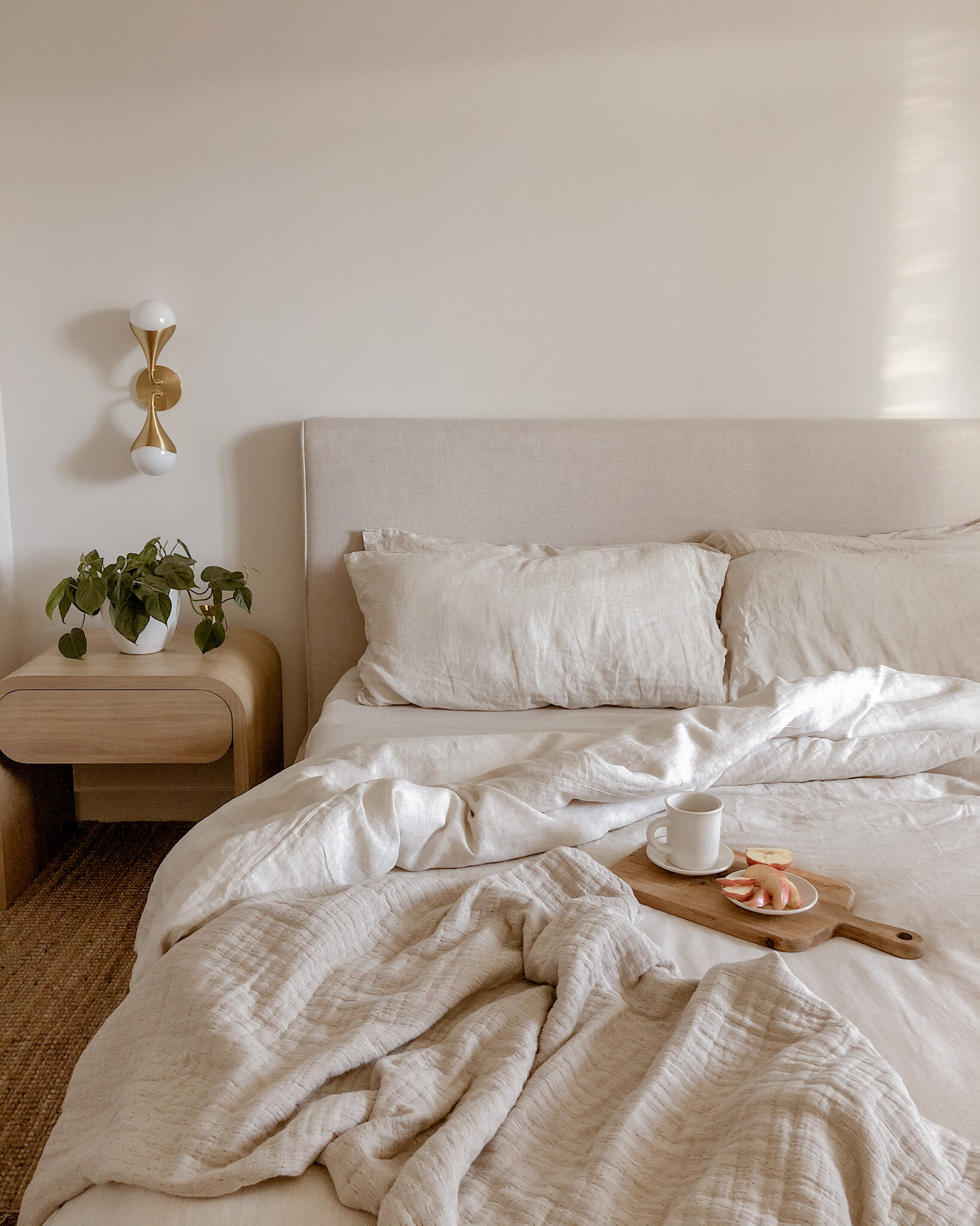
BEDDING FOR THE SOUL
My soul longs for peace, warmth and stability, and what else should a bedroom be besides peaceful? We (as a people) have been through so much over the past months, and we deserve a calm and safe place to lay our heads. This is why choosing to partner with The Citizenry on their bed bundle was an easy choice. Choosing the perfect color palette for my bedroom was important in creating just the calm I was looking for and the colors they offer in bedding are right up my alley, as they provide an array of neutral and natural color palettes. Our minds process colors and allow for a certain reaction, and this sand striped color in stonewashed linen offers relaxation. Like other browns, the sand stripe evokes warmth and security. It also gives a sense of earthy stability similar to many members of the brown family.


BEDDING WITH A STORY
I don't know about you, but I can surely appreciate a piece with a good story behind it. I like to know that the items that live in my home come from a place filled with artisans, designers, and dreamers. I want the pieces in my home to have been created with care, and to feel like it was created especially for me. This is why handmade goods are my favorite. My bed bundle was crafted in Portugal and the fabric is so luxurious, it's customary for the sheets to be given as a wedding present. How special is that? It makes me feel so good to know my bedding was touched by a real person who put love into them, and the process of making them involves their life experience, culture, and upbringing. When laying in these, you can truly feel the love, the joy, the craftsmanship.


BEDDING WITH A PURPOSE
I want to come home to a place that doesn't feel overwhelming and too complex. Their linen bedding is organic and offers a laid back and effortless yet luxurious appeal. This is exactly what I strive for as it relates to my bed (my sanctuary). It is truly the softest fabric you’ll touch, and it’s only gotten softer with every wash. To top it off, they are made sustainably and in a fair-trade environment. If you’d like to sample and experience this fabric for yourself, I’d suggest you test it out for yourself and order your own LINEN FABRIC SWATCHES.

On that note, I’d love to leave you with a little something to give you insight on what it is to be a creator, designer, and/ or craftsman, and hope that it inspires you to continue on encouraging these very important makers.
When buying from a creative, you’re buying more than just an object.
You’re buying hundreds of hours of failures and experimentation.
You are buying days, weeks and moments of frustration,
You are buying moments of pure joy.
You aren’t just buying a thing.
You are buying a piece of heart;
Part of a soul,
A moment of someone’s life.
Most importantly, you are buying that creative more time to do something they love.
Lying peacefully in my bed linens,
Ajai

A Little Nursery Inspo
Here I am, 26 weeks pregnant, and still have not solidified our nursery.
I know there are so many decisions to make as it relates to design and functionality, but it wouldn’t be honest if I said I had it all figured out. I’m doing so much research on the nursery do’s and don’ts, and have been learning so much.

Here I am, 26 weeks pregnant, and still have not solidified our nursery.
I know there are so many decisions to make as it relates to design and functionality, but it wouldn’t be honest if I said I had it all figured out. I’m doing so much research on the nursery do’s and don’ts, and have been learning so much. I plan to summarize this knowledge in a future blog post, but wanted to share the design I put together for our BIG reveal in the meantime. I love walking by this little vignette. It encourages and excites me for motherhood. I hope it inspires you as well. Please feel free to comment with any nursery tips you have, I’m all ears!
P.S. I know not to ever hang anything over the crib. This setup including the babies breath was strictly for the announcement.


Designing For Peace of Mind : An Intentional Office Space

What is intentional living to you?
For me, intentional living is defined as deliberately designing a space to satisfy my needs and the needs of others living in my home.
Like many others, the past six months have been stressful and anxious for my husband and I, and my goal was to combat these feelings by designing a tranquil and relaxing office space.

Living in high stress times
This time of year, my husband’s job prepares for a large conference, where they train thousands of customers - and this time, the event is being held from the homes of many employees. This is where intentional design comes in to play.
My goal was to ensure that my husband was comfortable and stress free during this time, and the remainder of this work-from-home period. This lead me to a specific design materials and color palette.

The Meaning of Colors
Did you know colors evoke feelings? For instance, I chose to spray paint the color of the table legs white, to evoke the feeling of light, cleanliness, and success. I incorporated neutral hues like taupes and browns for the barrel chair, large candle, table lamp, and vase, because these tones give a feeling of being calm and grounded. Feelings that are a necessity in a work space. I also sourced a vintage rug from Etsy, also rich in neutrals.


Warmth and light
My husband and I tend to work long hours, and this looks like working into the night sometimes. This is why lighting like the wooden table lamp, is important for our workspace. I also wanted to incorporate a drop pendant light that would specifically highlight the area of the desk where the computer would be, and could illuminate my husband as he takes his Zoom meetings and trainings into the late evening.
I wanted to avoid calling out an electrician, so I purchased a puck light to glue in place of the light bulb. I frosted the glass of the drop pendant with a white spray paint, then mounted the drop pendant to the ceiling. The puck lights give off a warm lighting, and the knitted throw blanket makes it convenient to get through the colder evenings, further making our workspace feel relaxing, calm, and warm.
For a video tutorial of this DIY drop pendant, you can visit my Instagram story highlight titled “Drop Pendant.”

Styling as a Minimalist
In my home, I practice minimalistic design, and have found it’s benefit as it pertains to mental health comes in handy. In my home, it’s important for us to have a clear space (rid of clutter) in order to think clearly. We also do well with having inspirational things in sight, so I added a picture frame with our baby’s first ultrasound images, books like “Down To Earth,” “This Is Home,” and “Home Body,” (all very good reads) reminding us of intentional and simple living.
The barrel chair was chosen for its breathable linen fabric, back support, and oval shape, which hugs us and makes us feel comforted throughout day. The wooden file cabinet gives us storage, and contributes to the warm and relaxing color palette. I added a wooden vase, and pampas grass for a beautiful aesthetic, and to keep the space feeling uplifting and creative.
Scents in the workspace
There is real power in smells, and certain scents can really help to get through a workday. I find that I write much better when I have a fig scent burning near by. For this reason, I keep a few soy candles assorted on our work desk.
The large brown candle is a fireside scent consisting of sandlewood, woodsy, and clove. The smaller ceramic candles are poppy and fig; these scents leave our space smelling of earth, fruit, and flower.

Colors, light, visuals, and scents; all things that heavily determine success in our workspace. Being sure to design with those elements in mind, was a necessity for me. We are quite happy working in this space, and mentally ready to take on any all work that presents itself. This is our way of working from home, intentionally.

How we updated our bathroom on a $250 budget

The $250 Budget
When we moved into our house we had to update both of our bathrooms in a hurry! Neither one of the bathroom’s toilets or sinks were water compliant (up to code) therefore, we could not have the water or gas turned on. This left us with a small budget, needing to update two bathrooms! After updating the larger bathroom, we were left with $250 to remodel the half-bath. Below is a before photo of what we were working with.

Getting Started
To get started, we thought it would make the most sense to immediately swap out the toilet and sink, as they were the primary reason we could not have the water and gas turned on. We found a traditional toilet and vanity during a BOGO deal! We bought the toilet for our full bath and got a toilet free, and bought a vanity for our full bath and got one free. We used the free toilet and sink for our half bath.
We also purchased different vanity knobs, a brass faucet, and sconce to go along with our design concept.

Design Concept
We decided on “vintage and quaint” for our design concept. This meant we would keep our older tile and use it as an inspiration for the new design! This lead us to choosing a paint color that would compliment the already existing floor tile.

Sweat Equity
We wanted to do all of our own work in this space, because we knew we’d get more bang for our buck. So we did all of our own patch work after removing the existing medicine cabinet and hardware.
We even swapped out the vanity and toilet on our own.

Mounting hardware first
From there, we mounted the new hardware, as it’s important to do this before starting any painting. Creating the holes for hardware like, toilet paper and towel holders, vanity mirrors, shelves and sconces, allowed us to get everything leveled and in the right spot. We removed the finishing hardware pieces once we had the correct positioning.

Time for Paint
Next, we prepped for paint! We used a laser-level to create a division line with painter’s tape. We decided to paint the top half of the bathroom white, and the bottom half Behr’s Billiard Green. This way we only had to purchase a small amount of paint and were able to use some left-over white paint we already had. After the paint dried, we removed the painter’s tape and added in the hardware. We replaced the original vanity knobs with new knobs, to achieve the quaint feel we desired for the space.

Styling
When it came to styling our bathroom, we decided to only purchase the functional pieces that were a necessity. We bought a marble soap dispenser, toothbrush holder, and a marble canister jar. We already had an extra Glassy Baby hanging around the house, and it happened to match well with the paint color, so we incorporated it into the design. The plants, soap, and toilet paper were also essential items that we already had - and made sense to style into the space.

The end result
There you have it! That’s how we designed our half bath for just $250. It was so important for us to make budget-friendly decisions when updating our bathroom. This way, we could splurge in the areas where it really counted - like our kitchen renovation for instance!

Parisian Kitchen Renovation: How I brought a touch of Paris to this Atlanta, Georgia Kitchen:We Saved over $100k on Our House, All Thanks To The Kitchen

Finding our House
Last July, my husband and I purchased out first home! We were driving through the cutest Atlanta neighborhood, and spotted a “for sale by owner” sign. From the looks of it, we could tell it was a fixer-upper, but that was right up our alley! The house was in a great location, and we were willing to put in the work we needed to get a deal on the house. That “work,” ended up being the kitchen.
We Saved over $100k on Our House - All Thanks To The Kitchen
We were able to save a little over $100 thousand on the house due to the poor condition of the kitchen. There were critter infestations, plumbing problems, and electrical issues, but the moment I stepped in to the kitchen, I could see its potential and knew exactly how I wanted to design the space.

A Galley Style Kitchen
Because the kitchen was galley-style, it immediately reminded me of the smaller cafes I’d visited in Paris during our vacations there. So it was absolutely important for me to incorporate that bistro-European aesthetic while keeping the layout of the kitchen and utilizing the space appropriately.
I started with knocking out the walls, and creating a 14 foot island with a quartz countertop. This makes the kitchen feel like the perfect spot to hangout, drink lattes and eat crepes! I added velvet and brass barstools, and hexagon floor tile to play up this vibe!

The Contrast
If you know me, you know just how much I love contrast! I wanted the kitchen to feel open and airy, but I also wanted it to feel extra moody and sophisticated (like Paris), so I painted our cabinets black, chose a black gas stove and range hood to pop against the subway tile. I decided to go with floating shelves up top, to open up the space. I added counter-to-ceiling subway tile to elongate the walls, and chose butcher-block to contrast the quartz countertop.

Texture, Texture, Texture
I love playing with textures! I decided on wood shelves against the tiled backsplash, and weaved accessories like dish coasters to go along with our bowls and plates. There are textured vintage wine and cocktail glasses incorporated into the design as well, this gives it a boutique and eclectic feel.

Lounging
My ultimate goal was to create a cozy space that would inspire conversation. Having the bar set-up makes it so enticing to lounge and chat with friends over a cup of joe or tea. It’s one of our favorite places to sit in the house. When guests are over our sink and faucet help us to rinse cups, bowls, and plates quick and easy; pop them into our dishwasher, and never miss a beat during our fun conversations. I also love the warm mid-century-style lighting we chose, this style drop pedant sets the Parisian mood just right.

The Journey
We spent $25k to update this kitchen, put in some sweat equity, and budgeted on greenery and foliage. We tiled the backsplash, painted the cabinets, and stained the butcher-block ourselves, and added a faux fiddle leaf fig and some pampas grass to save a bit on greenery. It was worth every moment, and we have absolutely enjoyed the journey. We are selling our house the week, and are looking forward to our next kitchen design adventure!

Loft Project : DIY Details From My Collaboration With Sarah Randall - Project

This past weekend, I teamed up with DIYer Sarah Randall to transform her mother’s loft! The goal was to create a vignette-design that would inspire her mother throughout the workday. I wanted to bring life into the space to really get some creativity flowing.

Here is a before photo of the loft:

This was such a fun space to transform! Now to the DIY and design details!

Lets Talk Walls!
The idea was to create texture, and we did this by installing beadboard utilizing a nail gun. It took four of us to apply a custom cut with a table saw and jigsaw for the small window cut-out.
Per my favorite staple, we painted the feature wall with Behr “Pacific Dunes” in a matte finish.


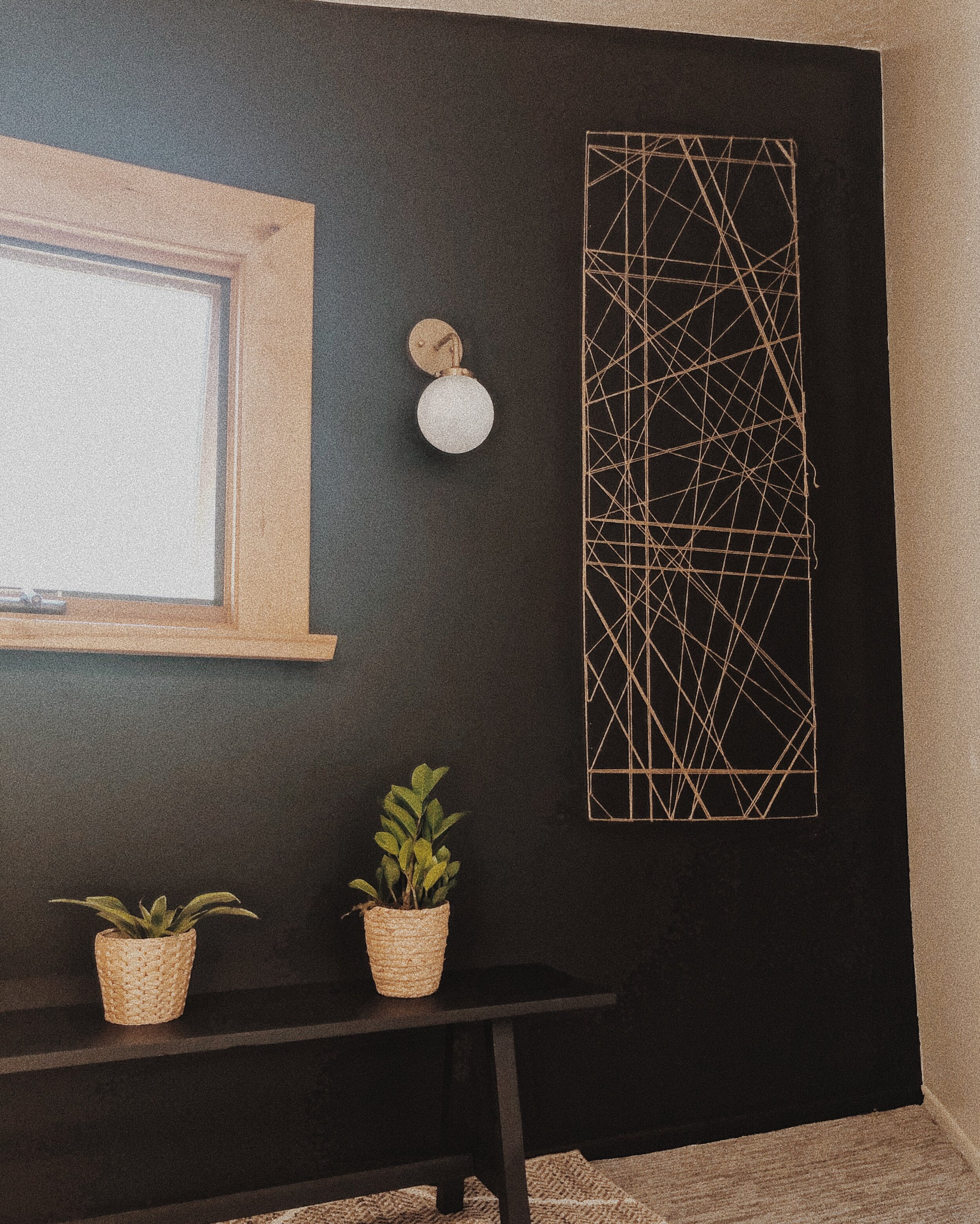
DIY Brass Sconces
Here’s one of my favorite sconces to use when remodeling on a budget, and its only $33 at Home Depot! We thought it would create the perfect “pop” by adding these sconces, but we needed to paint the black middle portion of the sconce to give the custom all-brass look we desired. We did this by spray-painting the scones with Satin Bronze Spray Paint.
We were able to avoid hardwiring the sconces by placing small remote-controlled puck lights inside, and wanted to conceal the puck lights, so we frosted the glass globes with a Rustoleum spray paint.

Custom Art Installation
Here I installed my infamous budget-friendly, yet very expensive-looking custom art.
Quick history on this piece! I ran out of budget during a client-project, and needed to source a feature artpiece with only $40 left to spare. This is when I came up with the idea for this art-piece!
That said, it was the perfect piece to compliment our loft-vignette and made for a great conversational piece in this space. I’ll be releasing a DIY tutorial this Thursday via my DIY blog newsletter, so sign up here if you want first dibs on all of my how-tos!

Custom Bench
We built a custom bench for this space, and boy is it pretty! We used 6' 1x2x12 for the seat, 2x2 for the legs and supports, and 1x2 to attach the legs to the seat (the materials were purchased for less than $20). You can find the tutorial for this build on @builds_by_kristen’s Instagram by clicking here.

Finishing Touches
As for the finishing touches, we added a patterned jute rug from Lowe’s, and basket-weaved plants consisting of some of my favorites: a rubber plant, a fiddle leaf fig, and for a bit of romance and magic - plenty of pothos!

I am beyond pleased with how this space turned out, and working alongside Sarah was absolutely amazing! I’m so excited for the next DIY collaboration!

Jute Twine Installation: How To create expensive wall art on a budget: 12 Easy Steps
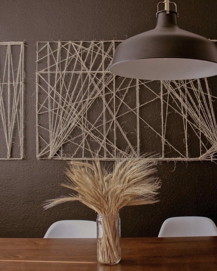
I’m so excited to finally be sharing this jute twine art installation with you! Here’s the story of how how it came to be: I ran out of budget during a client-project, and needed to source an art-piece for a feature wall, with only $40 left to spare. This is when I came up with the idea for this art-piece! It’s budget-friendly wall art with an expensive look!
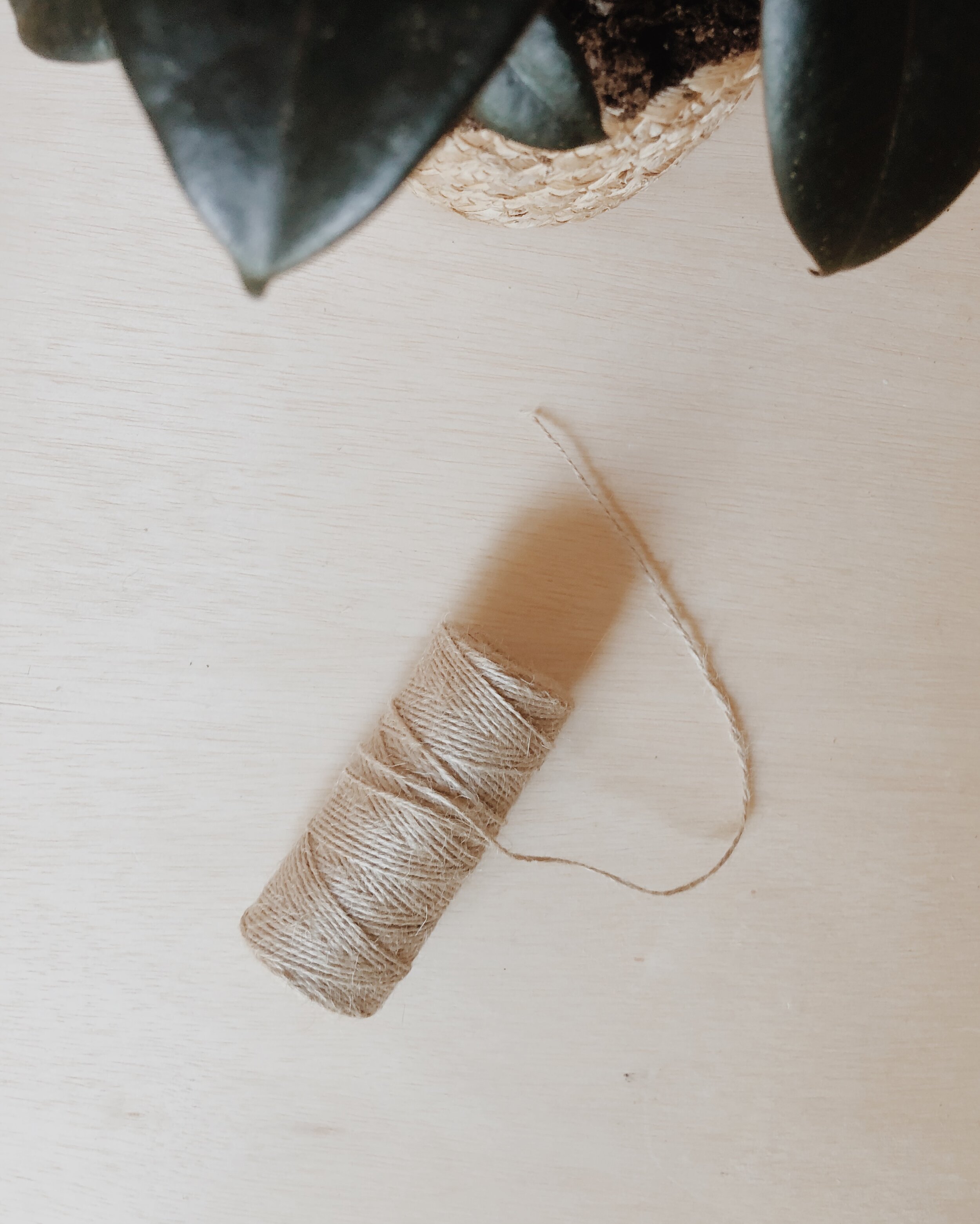
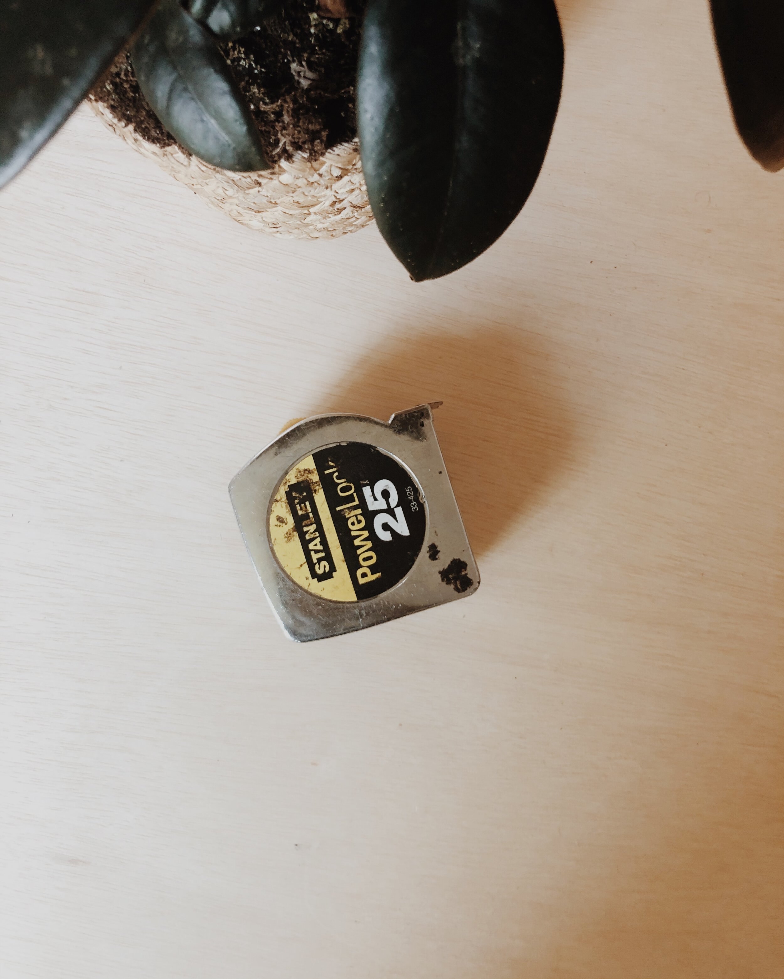

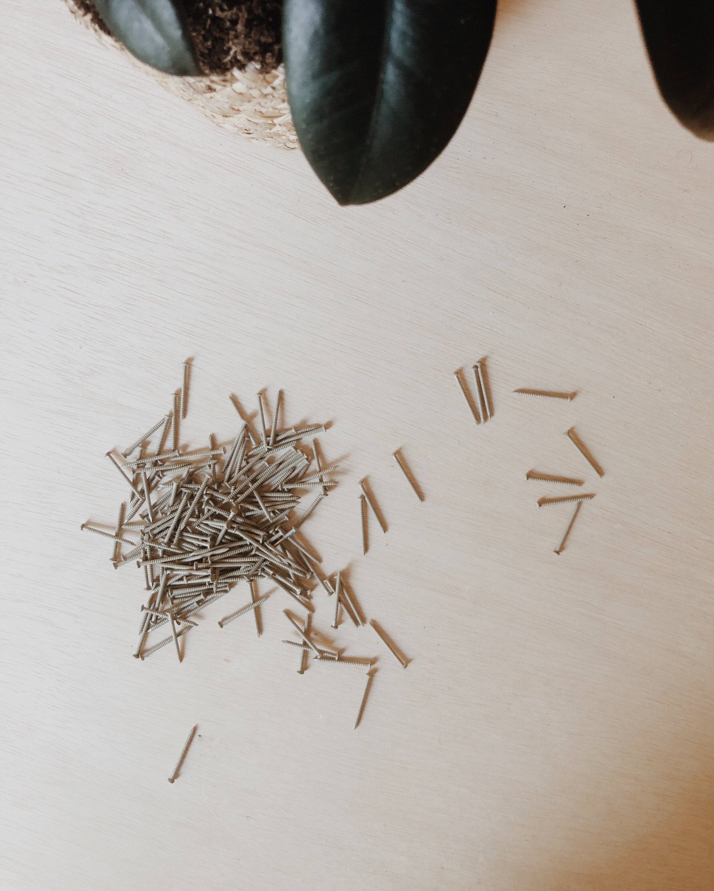
Here’s what you’ll need:
1.) Jute Twine
2.) Measuring Tape
3.) Hammer
4.) Lots of Nails
5.) A Level
6.) A Pen or Marker

STEP 1
Choose a space in your room to get an idea of how big you’d like to make the wall art. It’ll either be a square or a rectangle.
STEP 2
Once you choose the spot, Start by nailing in the top left corner nail, and measure how far to the right you’d like the next nail. Use the level to get a straight horizontal line.

STEP 3
My design will be a vertical rectangle, so I’ve started by measuring 7 inches (horizontally) in between each nail. I’ll only be hammering three horizontal nails to start.

STEP 4
Choose how long (far down) you’d like your wall art. After this, you’ll need to hammer in the bottom left corner nail. You can use your laser-level to help you get the line straight - by using the top left nail as a reference to create a straight vertical-line. This creates the border of the wall art.

STEP 5
Measure 7 inches to the right to place the next nail. Use the laser-level to get a straight horizontal line. Measure another 7 inches to the right to mark the spot for the bottom right corner nail.
STEP 6
Hammer in the bottom right corner nail. This is the last nail you’ll need to complete the border for the wall art. You can use your laser-level to help you get the line straight - by using the top-right nail as a reference to create a straight vertical-line.

STEP 7
Now take your roll of twine and tie the end piece to the top right-corner nail. Make a knot around this nail. Then use the twine to wrap a border around each nail. One wrap-around each nail will do.

STEP 8
Wrap until you make it back to the top left-corner nail. Now you have your border! Make another knot when you’ve made it back to the top left-corner nail.

STEP 9
Release your string, so that you can start making marks for each border nail you’ll need to hammer in. For this design, I chose to go down 8 nails - two inches in between each nail. I did this on both vertical sides of the border.

STEP 10
After you’ve made all of your marks, start hammering in all of the nails.

STEP 11
Above, is a picture of what it will look like once you’ve hammered in all of your border nails. Afterwards, I decided to add a nail in the center of the art piece. I thought this would make a really cool geometric pattern.

STEP 12
Now grab your jute twine from the top left corner, and free-style a design!

There are no rules as to what design you can come up with. Just be creative and do what you feel. This is what makes a piece like this custom and unique!

Here’s the design I came up with this time around!

Now you know how to make my jute twine wall art installation! Its such a fun art piece to create and I can’t wait to see your wall art! If you post your piece to instagram, please hashtag #TrueHomeDIY.
Drop a comment below if you have any questions, and I’ll get back to you ASAP!
Happy Designing & DIYing,
Ajai

How I saved money by tiling my own kitchen backsplash, using subway tile.

If you want to build confidence, do something you’ve never done before.
This was my approach to tiling our kitchen backsplash for the first time. I must admit, I was a bit scared to get started initially, but after receiving a few quotes, all averaging out to around $3,000, I figured it was time for me to put my DIY tights on and get to work.
I wanted to be lenient and give myself grace, so I gave myself two weeks to complete the project. My husband travels a lot for work, so I wanted to go about it like I’d be the only one working on the project - and if / whenever he could join in, would be great too!
That said, I’m going to break down this DIY the way I learned. I watched two youtube videos, and researched the materials I would need to get started.
Along with a list of materials, and the links to the videos, I’m also going to leave a few tips (knowing these tips will help the process and leave less room for errors). Before I get to it, I want to encourage you to go about this with an optimistic attitude. Give yourself time (don’t rush). It’s important to have patience when you are laying subway tile. It is a tedious-sort-of-work, but there is so much beauty in these details.
Alright, let’s start with watching the videos first!
Two videos I’m encouraging you to watch before getting started:
Video Number One:
(TILING)

Video Number Two:
(Grouting)

Here’s a list of what you’ll need:
Adhesive
Grout
Sealant
A Spirit Level
Measuring Tape
A Tile Bead
Grout Finisher


My Tips To You:
Be as patient with yourself as you can and make this a fun and enjoyable project. Play music and have a good time.
Try to keep your space clean as you go along. A clean space, is a safe space.
You can never have enough drop cloths.
Make sure to buy a 15% overage of tiles - you can return the extra boxes you don’t use once you’ve finished the product. Would suck to get into the groove of things only to have to run to the store because you’ve ran out of tile.
Prepare to use quite a few tubes of caulk. I used seven caulk tubes for my project.
Make sure your caulk matches your grout.
When it’s time to grout, do it in small sections.

Our kitchen has come such a long way, and we still have a few things to do before we can call it complete. Tiling the backsplash knocked out a BIG to-do for us. I really enjoyed this project and am so proud of the work we did on this kitchen. We’ve been smiling non-stop every time we pass by this room. Not to mention, we saved $2,600 by doing it ourselves. The materials came in a little under $400.


Now let’s be clear, I understand that there are experts who could’ve done this job, and I believe in leaving most of the work to the experts. However, we are first-time home-buyers and had to remodel the entire kitchen, update our plumbing and electric, along with plenty of other things around the house. Thus, we decided to take matters into out own hands for some of the cosmetic projects we were confident and skilled enough to do.
For anyone willing to brave it out and save on such an expensive project, I am hoping you have just as much fun as we did tiling our kitchen. If you decide to be brave and tile your backsplash, I’d love to hear about how it came out. please come back and share under this post to encourage all of the other tile-DIYers!
XoXo,
Ajai @truhome_

How To Create A Beautiful Album Display For Your Photos

I recently read a blog about intentional design and how “feeling” should always be considered in home decor. This resinated well with me, as I’m always considering the psychology of a space, and what emotion it will evoke on the people utilizing it. For this reason, I am so happy to share a design secret of mine that will be sure to leave breadcrumbs of memories and feelings throughout an intentionally decorated home.

A few years ago, I wondered how I could share more of the memories my husband (Jonathan) and I had created throughout or home, and in an aesthetically pleasing way.
I thought of the traditional photo album, but soon realized going this route would lead my well-cherished photos and memories straight into retirement. I wanted these photos to easily be seen everyday, and to have a display that encouraged me to take a trip down memory lane.
During this time, Jon and I were in the middle of making payments towards our wedding photographer and deciding on whether we could afford to have a videographer at the wedding as well. That said, I wanted to consider the costs of choosing the traditional wedding album to display our wedding photos.

After much research I found a 33 dollar glass box, that at the time was marketed as a jewelry box. I checked for its dimensions and realized they were the exact same size as your typical 5x7 photo. This made we wonder off into the world of Amazon, looking for other glass boxes that also reflected the typical photo sizes.

After 2 hours spent shopping through Amazon.com, I found the perfect vendors to order my 5x7 and 4x6 glass boxes. I’d decided I would print my engagement photos to fit a copper 4x6 glass box , and that I’d print my wedding photos to fit the brass 5x7 glass box I ordered.

For my wedding photos, I wanted a high-quality look and feel, so I chose a double-thick matte option from Artifact Uprising. I selected their Everyday Print Set and ordered 100 photos.
to save a few more dollars, I went to my local print shop to print my engagement photos, and they also turned out beautifully.

This photo album hack is one of my favorite home decor tips to share. It’s elegant, and perfect for displaying and keeping my photographs safe. Both glass boxes will hold over 100 prints, and the presentation is so lovely. They are also quite the conversational piece, you’ll too be sharing this secret with your friends and loves ones!